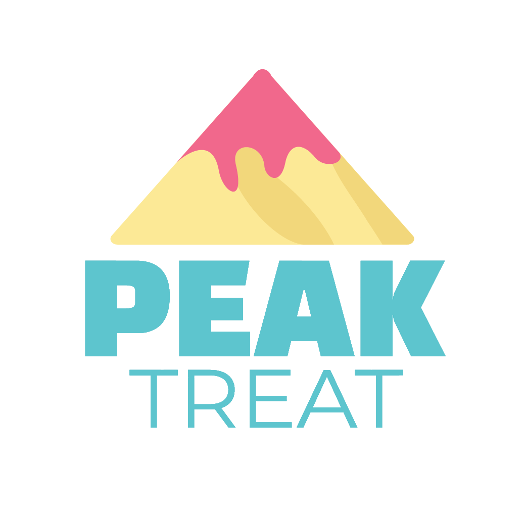
Primary Logo
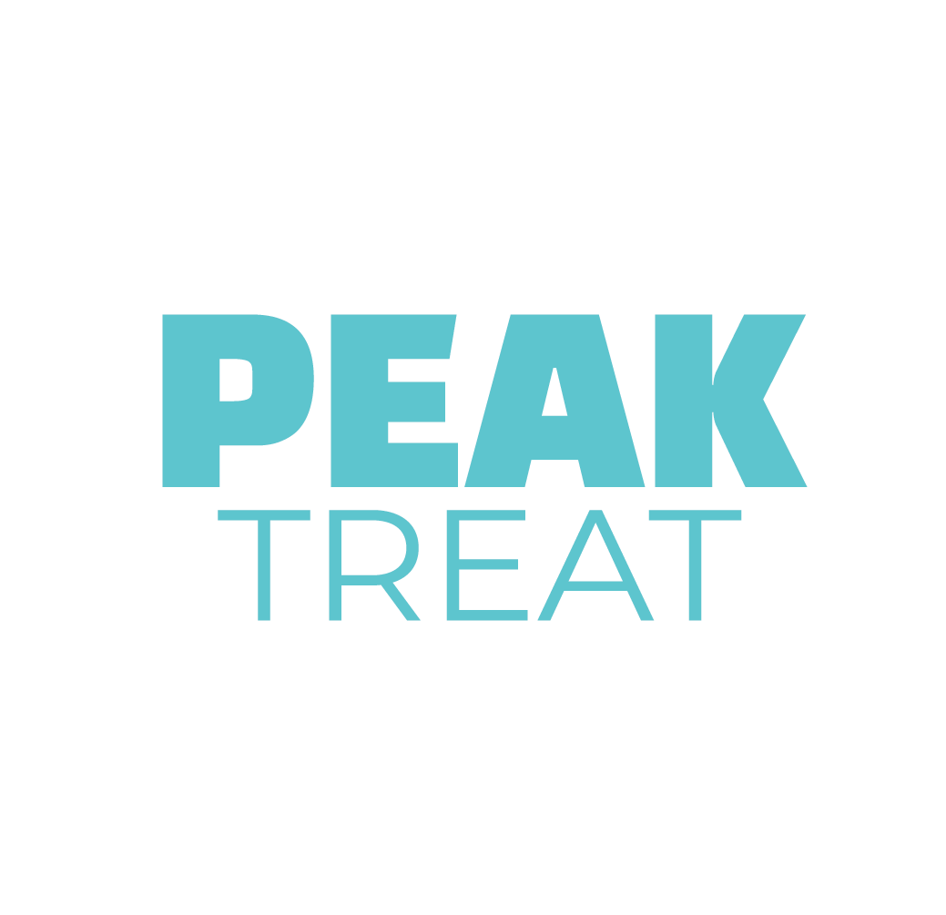
Secondary Logo

Brand Symbol
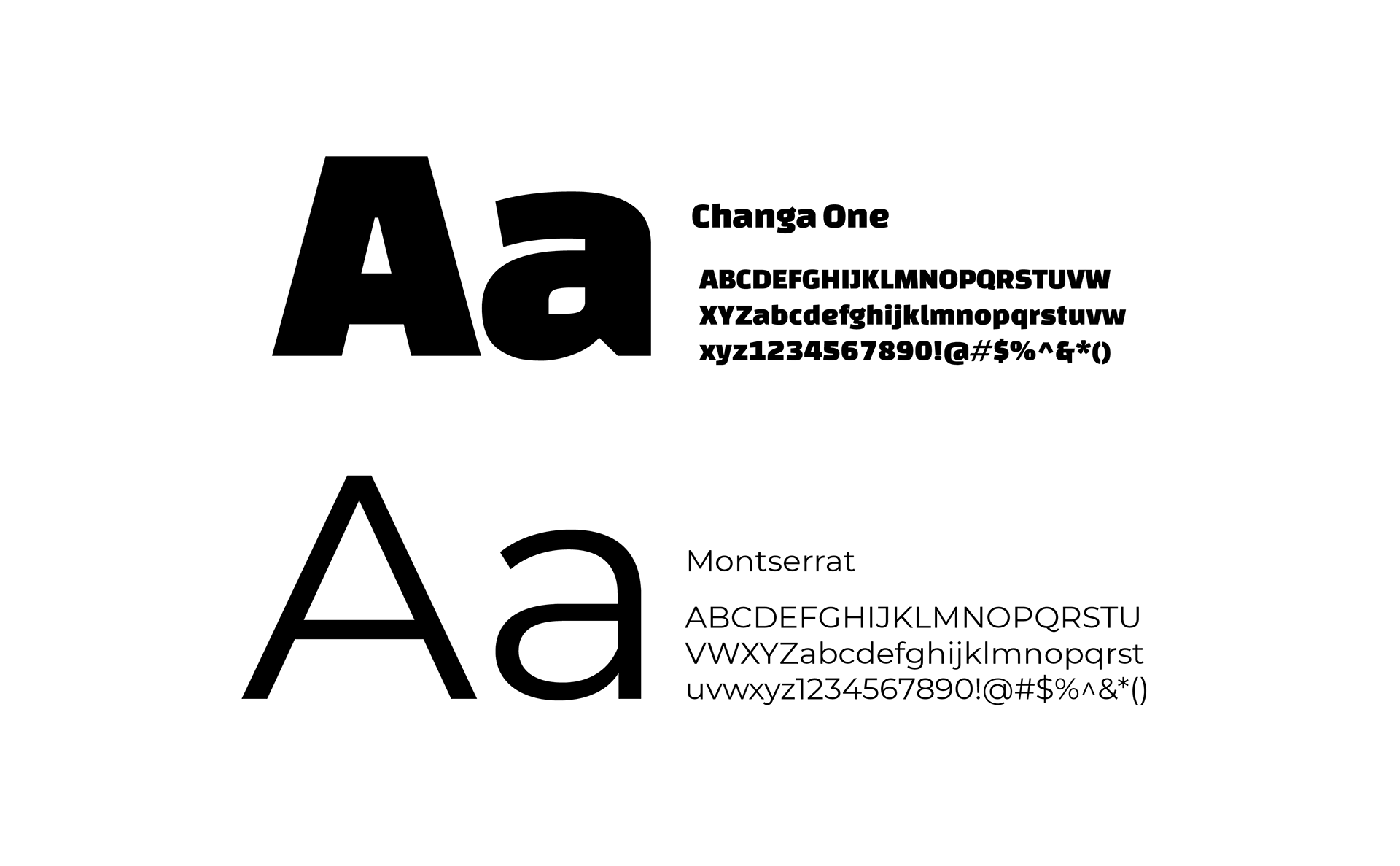
Fonts
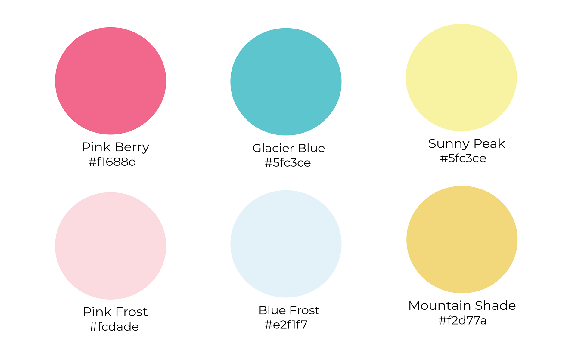
Color Palette
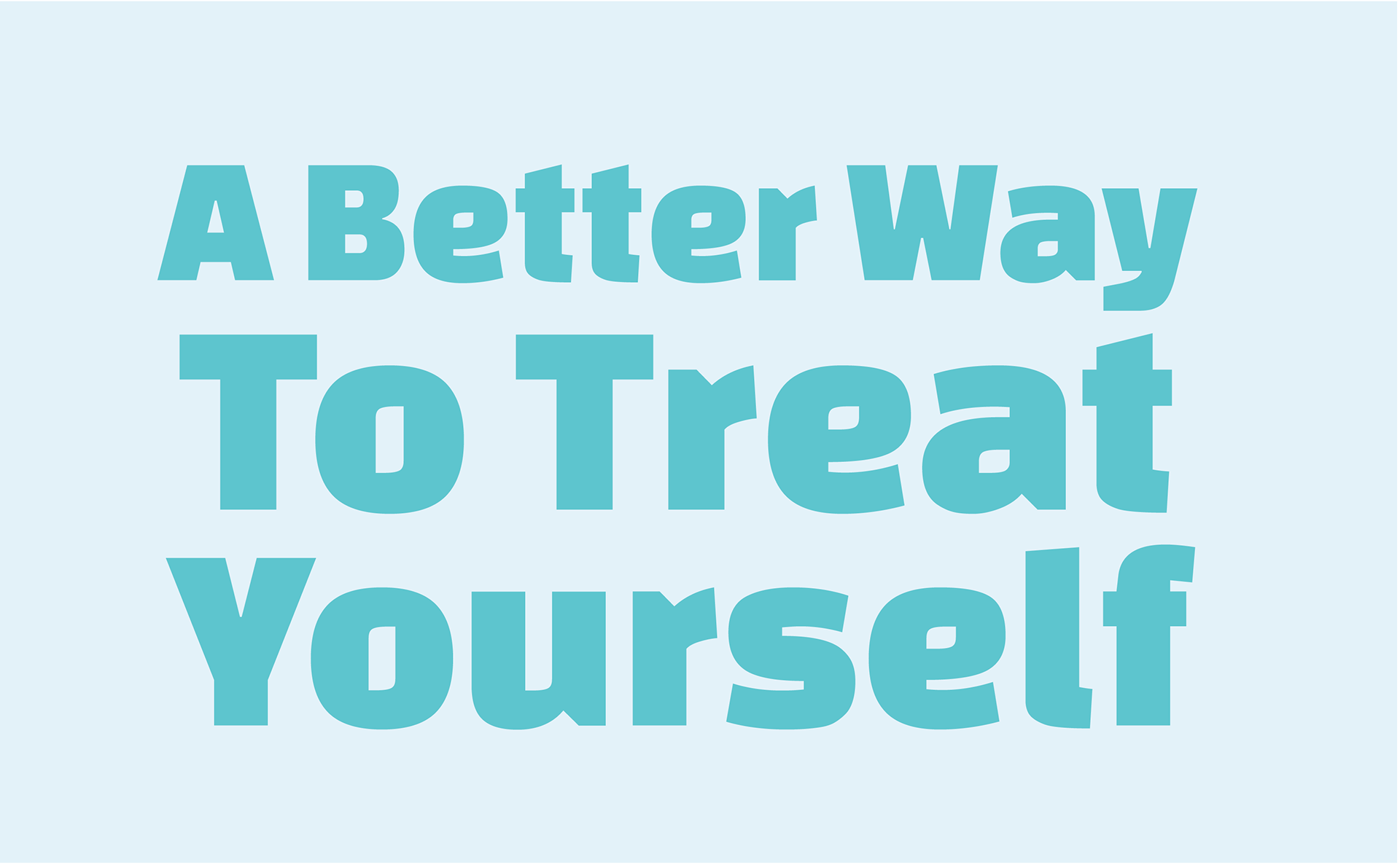
Peak Treat is a branding project for an ice cream shop designed around the idea that dessert and healthy habits can exist together. Designed as a high-protein, lower-calorie ice cream shop, the concept was created for people who want to enjoy a treat without feeling like they have to sacrifice their goals. The brand focuses on making ice cream feel fun, colorful, and rewarding while offering a more balanced approach to indulgence. This project included creating the full brand experience from the logo and packaging to merchandise, social media, storefront materials, and website concepts. Through playful visuals, bright colors, and a cohesive identity, Peak Treat was designed to feel energetic, approachable, and memorable while encouraging customers to see dessert in a new way.