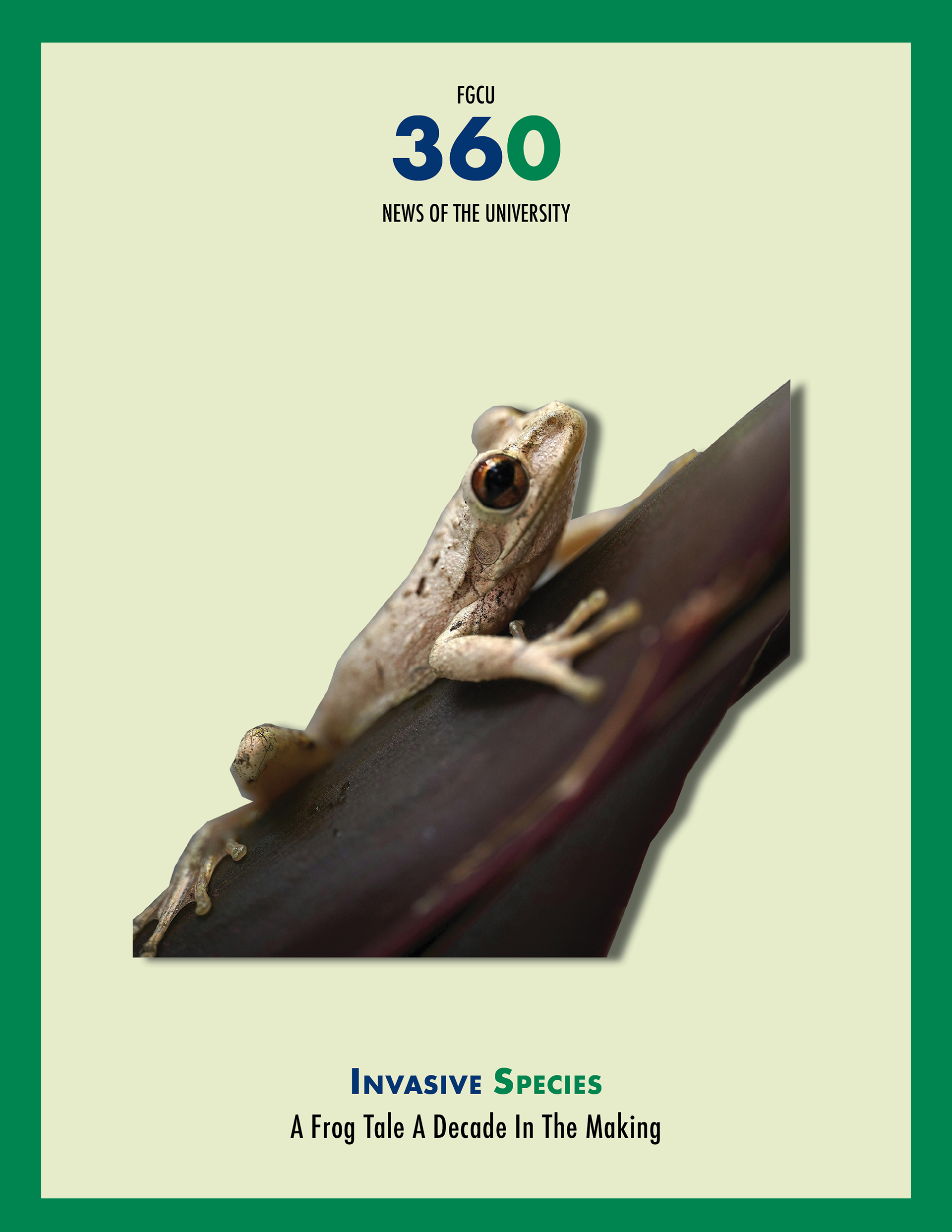
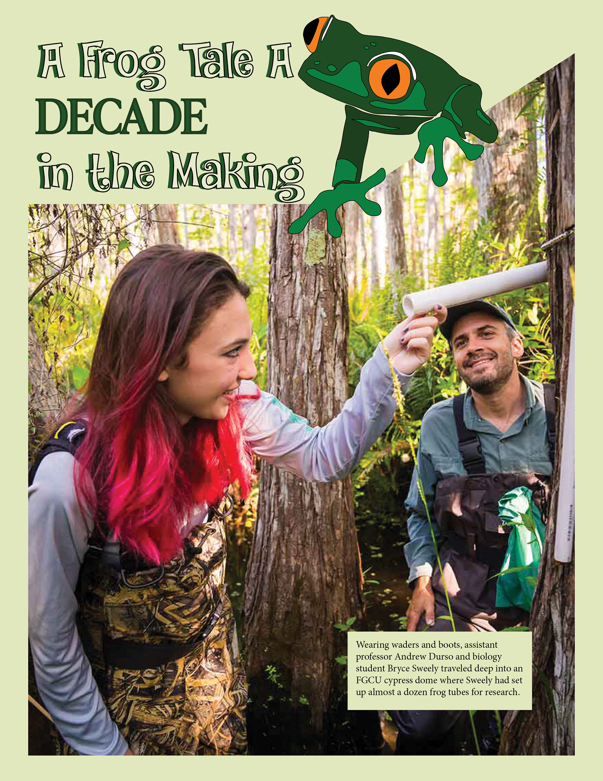
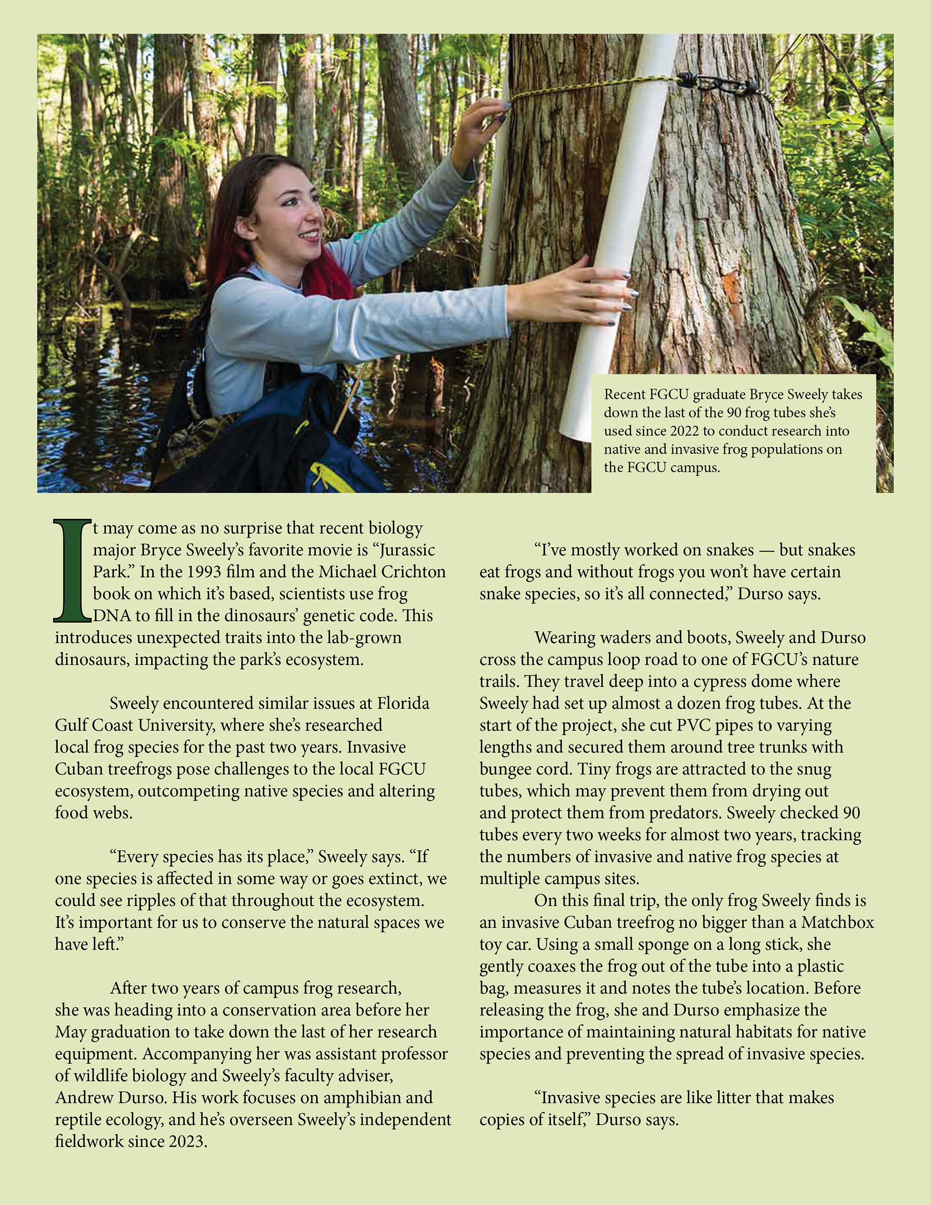
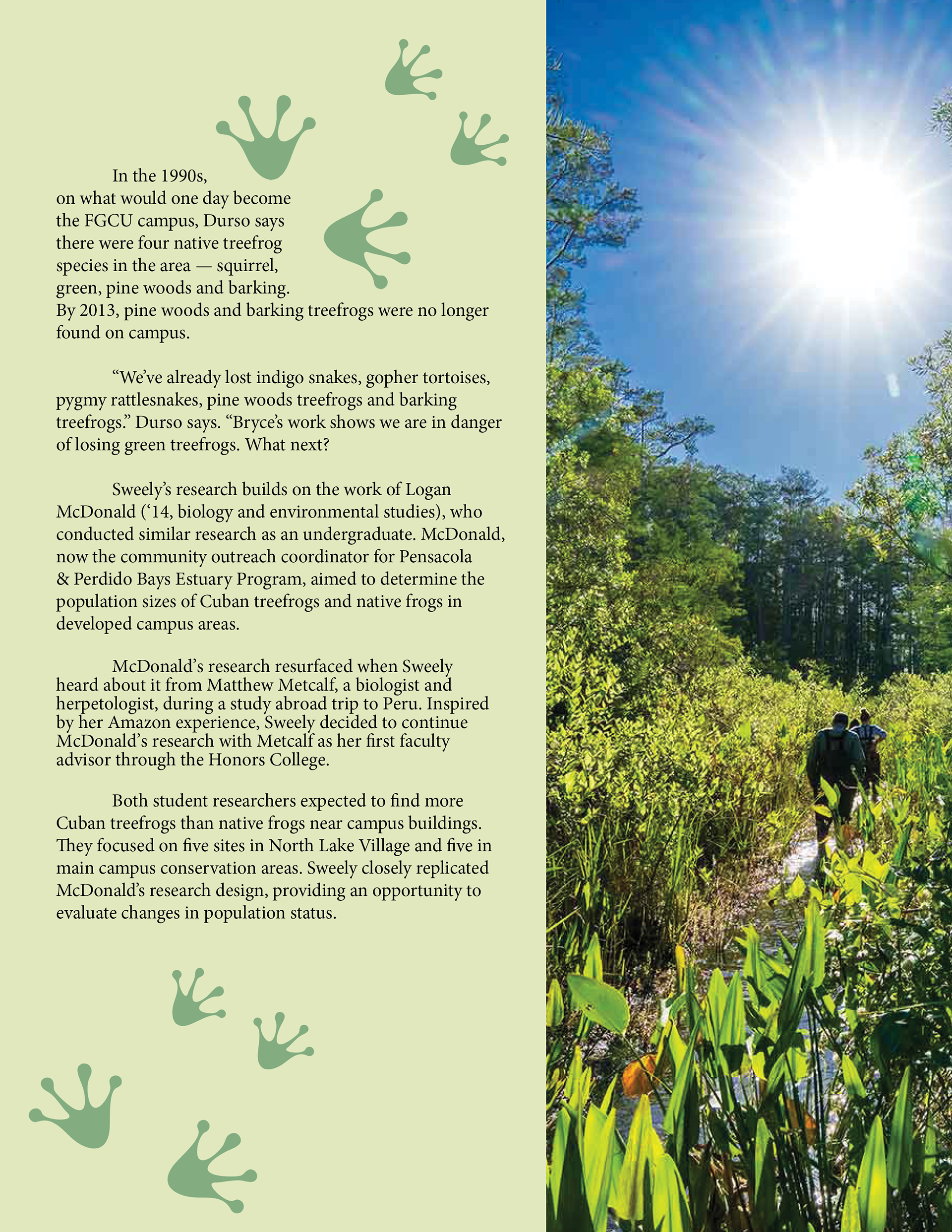
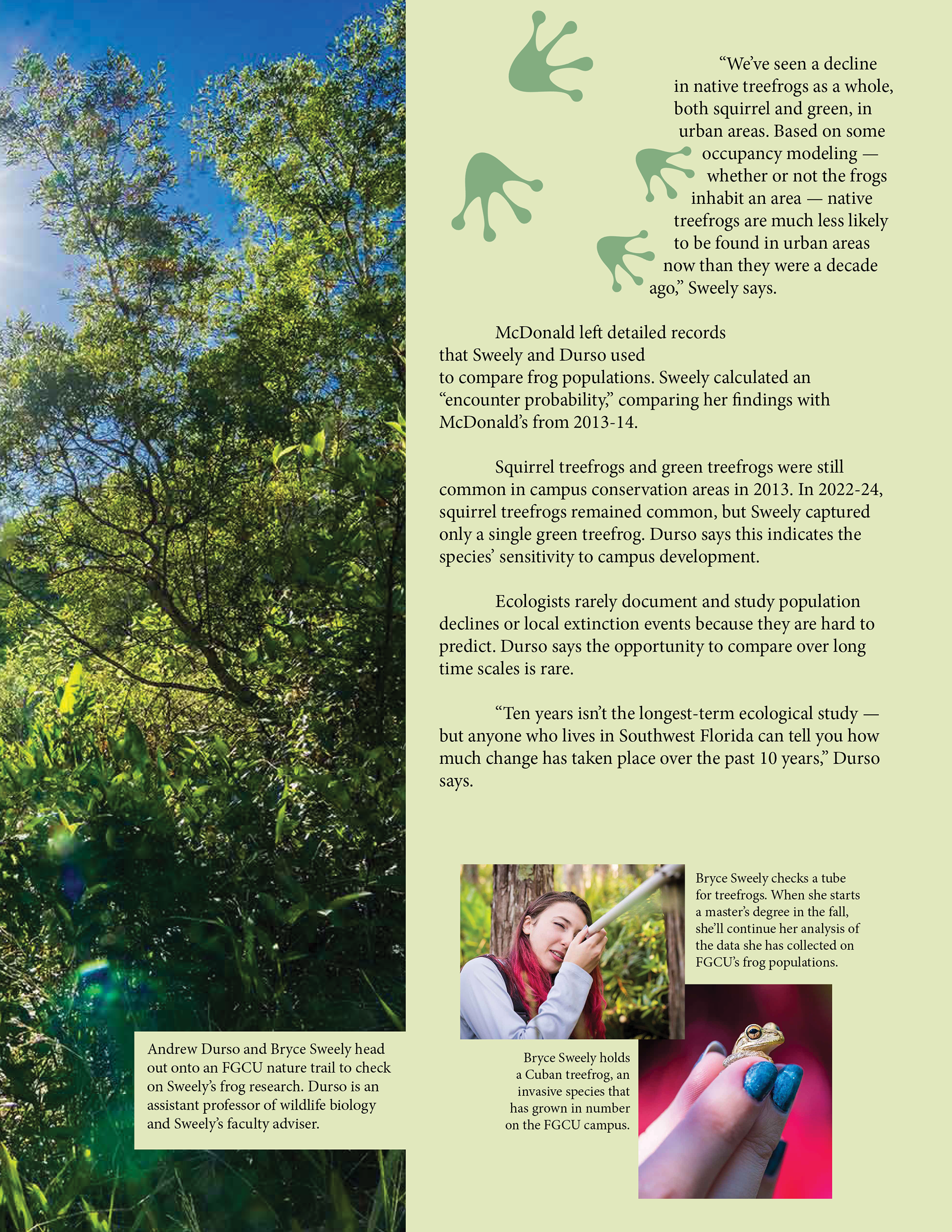
FGCU 360 Editorial Magazine Layout
For this editorial design project, I redesigned FGCU 360’s article A Frog Tale: A Decade in the Making into a typography-driven magazine feature. The goal was to transform a university news article into a more engaging print experience through thoughtful type choices, visual hierarchy, and expressive page composition.
Using Adobe InDesign, I explored how typography and imagery could work together to guide the reader through the story while emphasizing themes of environmental research and conservation. The layout incorporates custom headline treatments, a drop cap, varied text arrangements, and integrated image captions to create a reading experience that feels both informative and visually engaging.
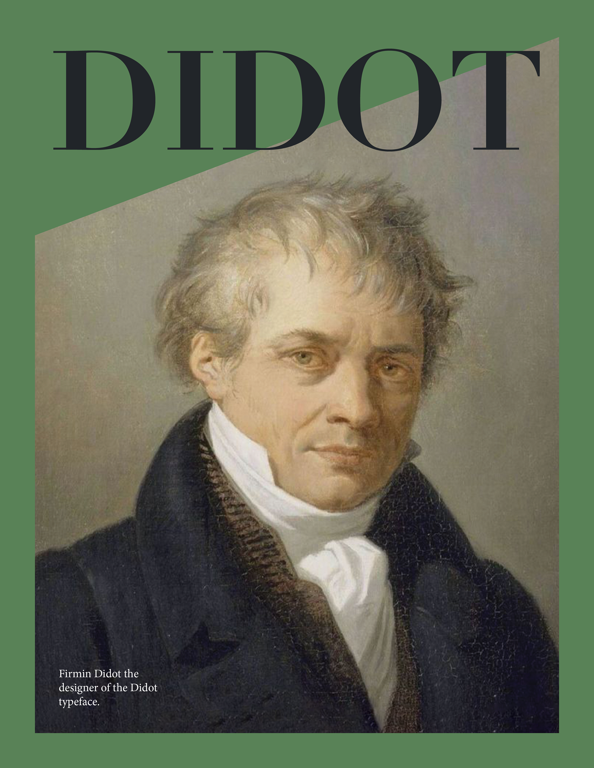
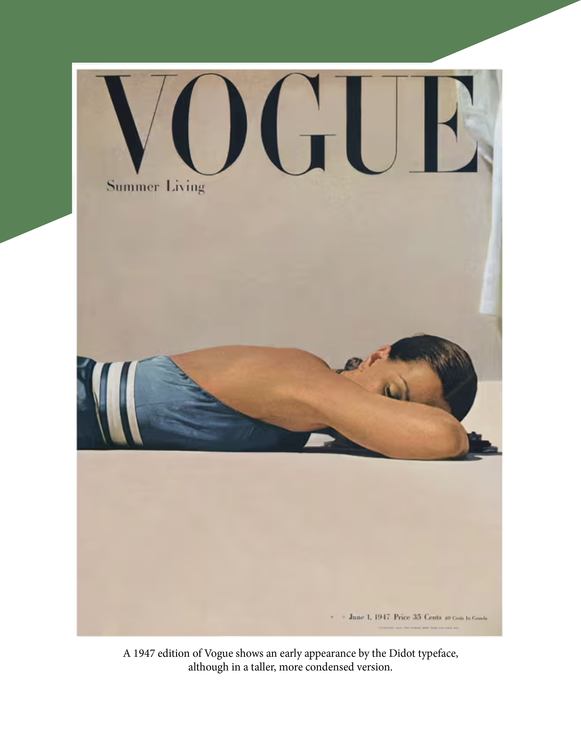
History of Typography Editorial Layout: Didot
This project explored the history and influence of the Didot typeface through both research and editorial design. Beginning with a written article on the historical significance of Didot, I then transformed the content into a multi-page magazine layout that visually reflected the elegance and refinement associated with the typeface and its origins.
Using typography as both content and design inspiration, I created an editorial experience that emphasized hierarchy, composition, and visual storytelling. The layout incorporates characteristics associated with Didot, including contrast, balance, and sophistication, to create a publication that connects typography history with contemporary editorial design.
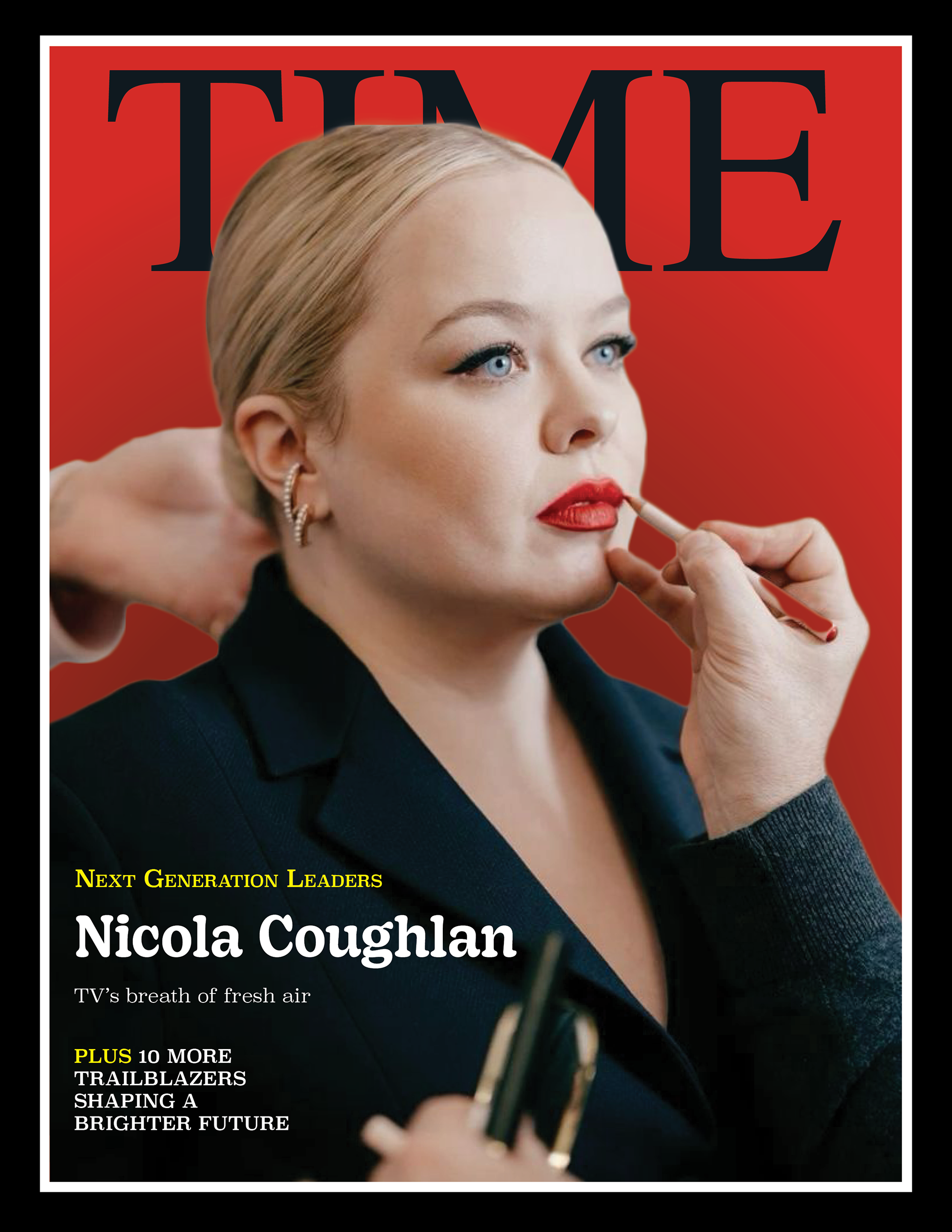
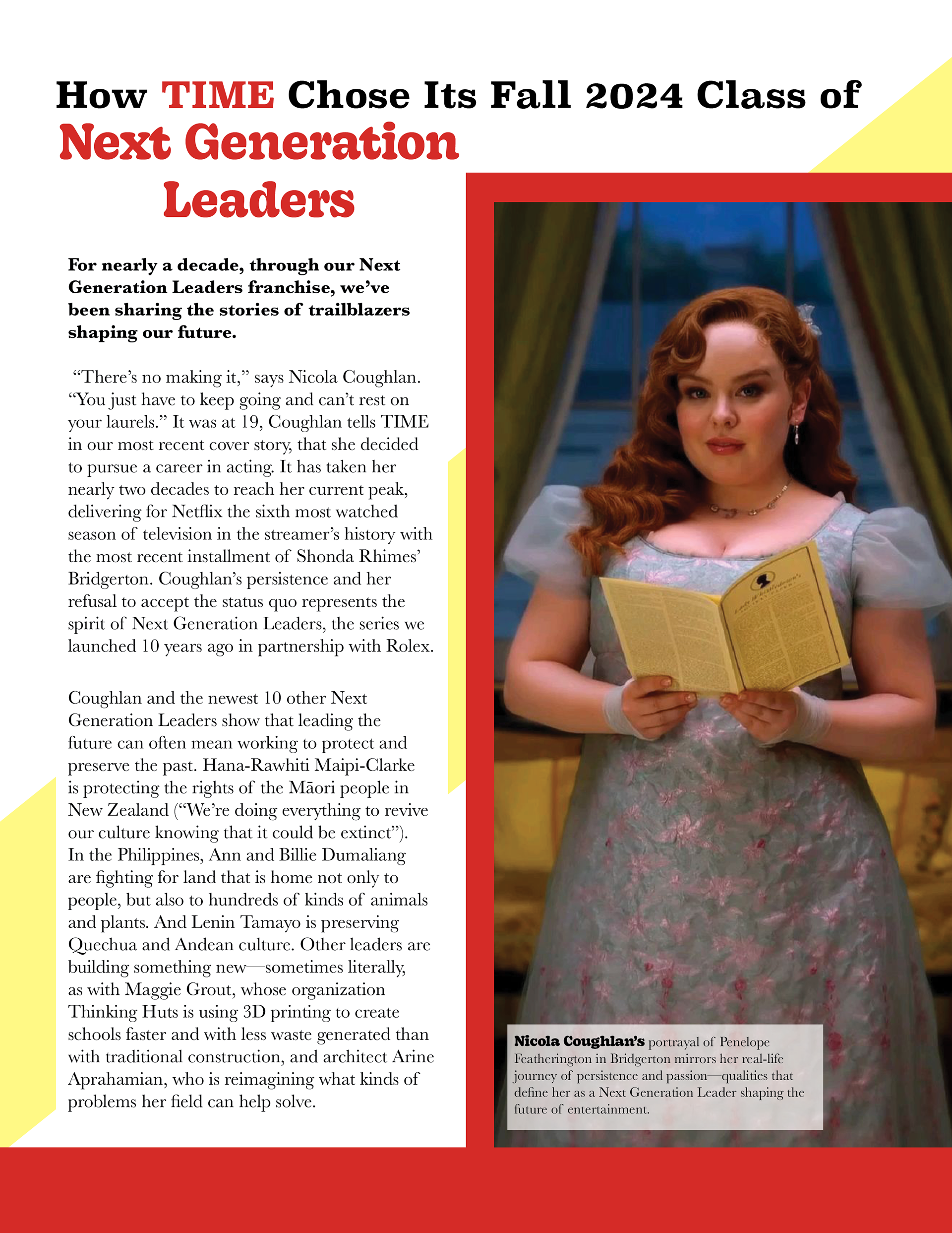
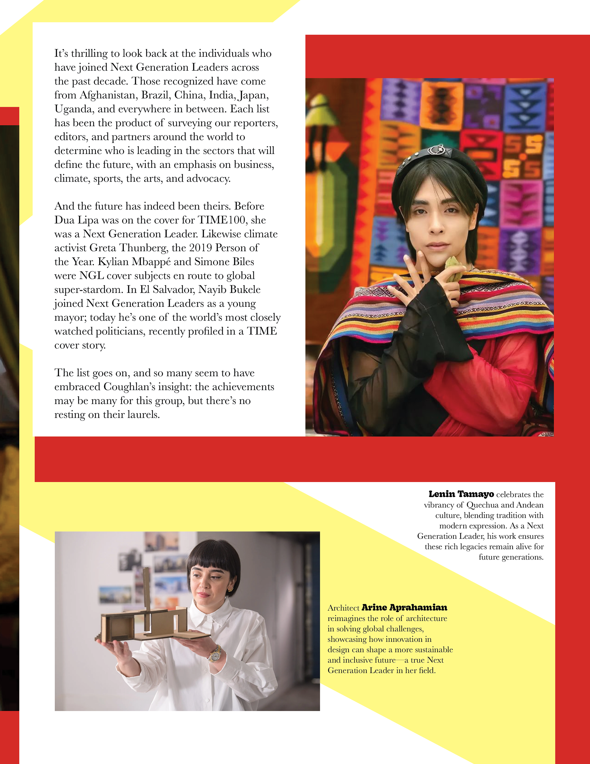
TIME Magazine Redesign: Next Generation Leaders
For this editorial design project, I reimagined the cover and feature spread for TIME Magazine’s Next Generation Leaders article featuring Nicola Coughlan. The goal was to redesign both the magazine cover and a multi-page article layout while maintaining the publication’s credibility and appeal to a contemporary audience.